&geometry(187x114) "ESANZ")
Four Key Medical Statistics Plots Every Clinician, Sonographer and Researcher Should Know
Bonita Anderson says, "interpreting medical research often comes down to reading the right graph correctly. A few core statistical plots appear again and again in clinical papers and trials. Understanding them helps you quickly judge whether a study is meaningful, biased, or clinically useful."
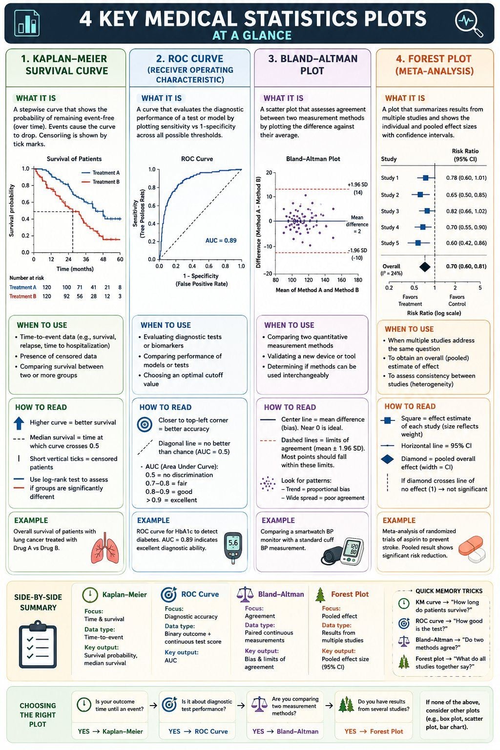
Four Key Medical Statistics Plots Every Clinician, Sonographer and Researcher Should Know
Interpreting medical research often comes down to reading the right graph correctly. A few core statistical plots appear again and again in clinical papers and trials. Understanding them helps you quickly judge whether a study is meaningful, biased, or clinically useful.
Here are four foundational medical statistics plots—what they are, when to use them, and how to interpret them.
1. Kaplan-Meier Survival Curve
What is it?
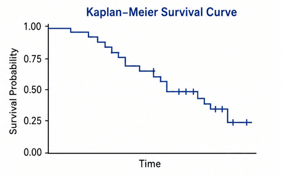
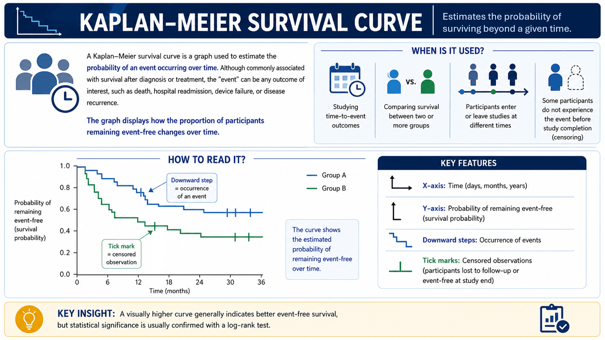
A Kaplan-Meier survival curve is a graph used to estimate the probability of an event occurring over time. Although commonly associated with survival after diagnosis or treatment, the "event" can be any outcome of interest, such as death, hospital readmission, device failure, or disease recurrence.
The graph displays how the proportion of participants remaining event-free changes over time.
When is it used?
A Kaplan-Meier curve is used when:
- Studying time-to-event outcomes
- Comparing survival between two or more groups
- Participants enter or leave studies at different times
- Some participants do not experience the event before study completion (censoring)
Examples:
- Comparing survival after two cancer treatments
- Time until heart valve replacement failure
- Hospital readmission rates following surgery
How to read it?
Key features:
- X-axis: Time (days, months, years)
- Y-axis: Probability of remaining event-free (survival probability)
- Downward steps: Occurrence of events
- Tick marks: Censored observations (participants lost to follow-up or event-free at study end)
Interpretation example:
If one treatment group's curve remains consistently higher than another, that group demonstrates better event-free survival.
Key insight: A visually higher curve generally indicates better event-free survival, but statistical significance is usually confirmed with a log-rank test.
2. ROC Curve
What is it?
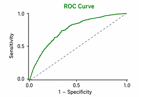
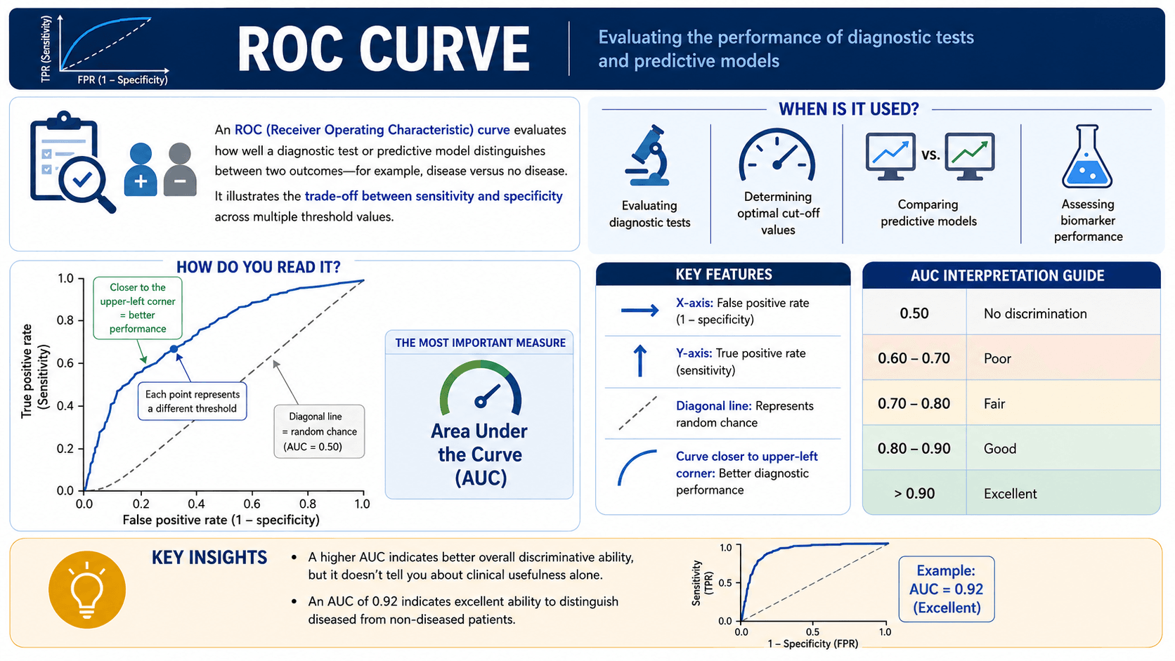
An ROC (Receiver Operating Characteristic) curve evaluates how well a diagnostic test or predictive model distinguishes between two outcomes—for example, disease versus no disease.
It illustrates the trade-off between sensitivity and specificity across multiple threshold values.
When is it used?
A ROC curve is used when:
- Evaluating diagnostic tests
- Determining optimal cut-off values
- Comparing predictive models
- Assessing biomarker performance
Examples:
- Determining a troponin threshold for myocardial infarction diagnosis
- Evaluating an echocardiographic parameter for identifying pathology
- Comparing machine learning prediction models
How do you read it?
Key features:
- X-axis: False positive rate (1 ? specificity)
- Y-axis: True positive rate (sensitivity)
- Diagonal line: Represents random chance
- Curve closer to upper-left corner: Better diagnostic performance
The most important measure is:
Area Under the Curve (AUC)
Interpretation guide:
- 0.50 ? No discrimination
- 0.60-0.70 ? Poor
- 0.70-0.80 ? Fair
- 0.80-0.90 ? Good
- >0.90 ? Excellent
Key insights:
- A higher AUC indicates better overall discriminative ability, but it doesn’t tell you about clinical usefulness alone.
- An AUC of 0.92 indicates excellent ability to distinguish diseased from non-diseased patients.
3. Bland-Altman Plot
What is it?
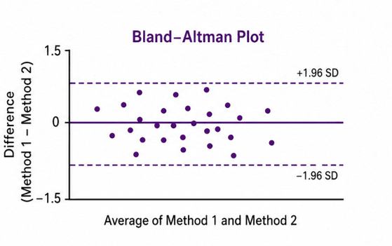
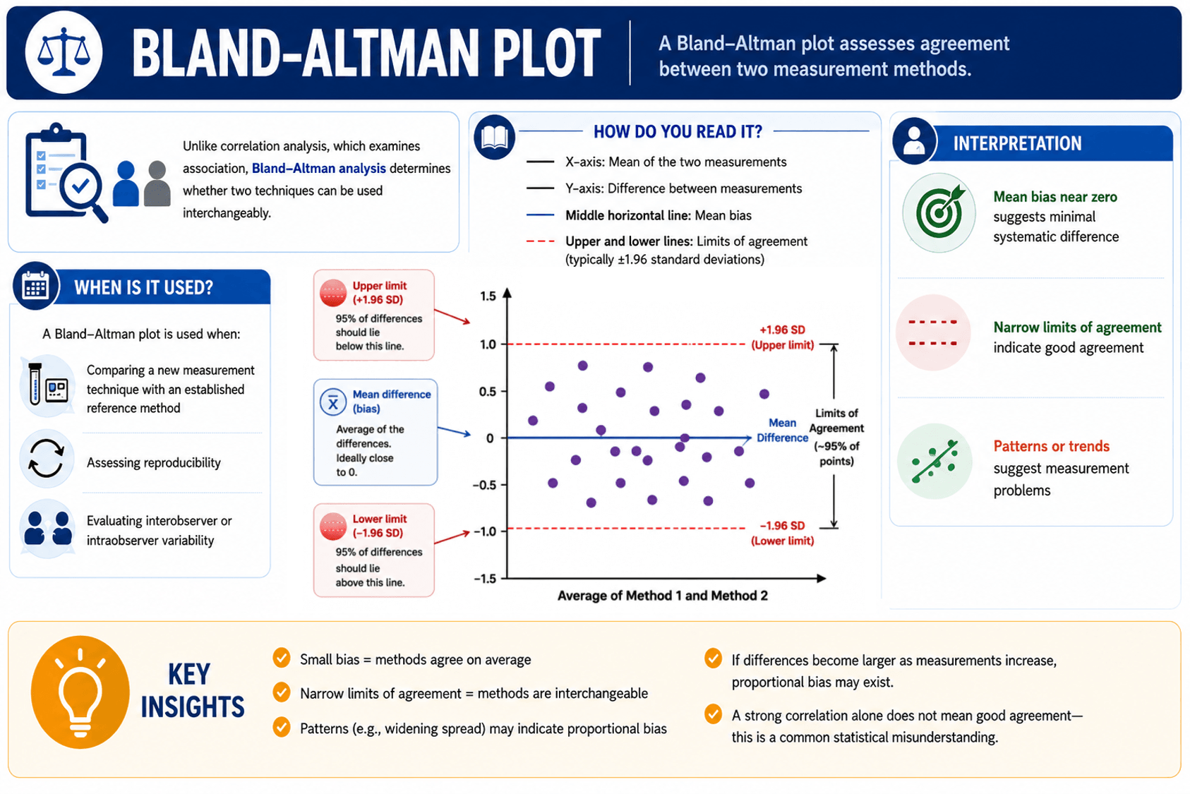
A Bland-Altman plot assesses agreement between two measurement methods.
Unlike correlation analysis, which examines association, Bland-Altman analysis determines whether two techniques can be used interchangeably.
When is it used?
A Bland-Altman plot is used when:
- Comparing a new measurement technique with an established reference method
- Assessing reproducibility
- Evaluating interobserver or intraobserver variability
Examples:
- Comparing echocardiographic and MRI ventricular volume measurements
- Agreement between two blood pressure devices
- Comparing manual versus automated measurements
How do you read it?
Key features:
- X-axis: Mean of the two measurements
- Y-axis: Difference between measurements
- Middle horizontal line: Mean bias
- Upper and lower lines: Limits of agreement (typically ±1.96 standard deviations)
Interpretation:
- Mean bias near zero suggests minimal systematic difference
- Narrow limits of agreement indicate good agreement
- Patterns or trends suggest measurement problems
Key insights:
- Small bias = methods agree on average
- Narrow limits of agreement = methods are interchangeable
- Patterns (e.g., widening spread) may indicate proportional bias
- If differences become larger as measurements increase, proportional bias may exist.
- A strong correlation alone does not mean good agreement—this is a common statistical misunderstanding.
4. Meta-analysis Forest Plot
What is it?
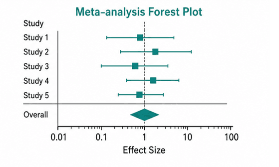
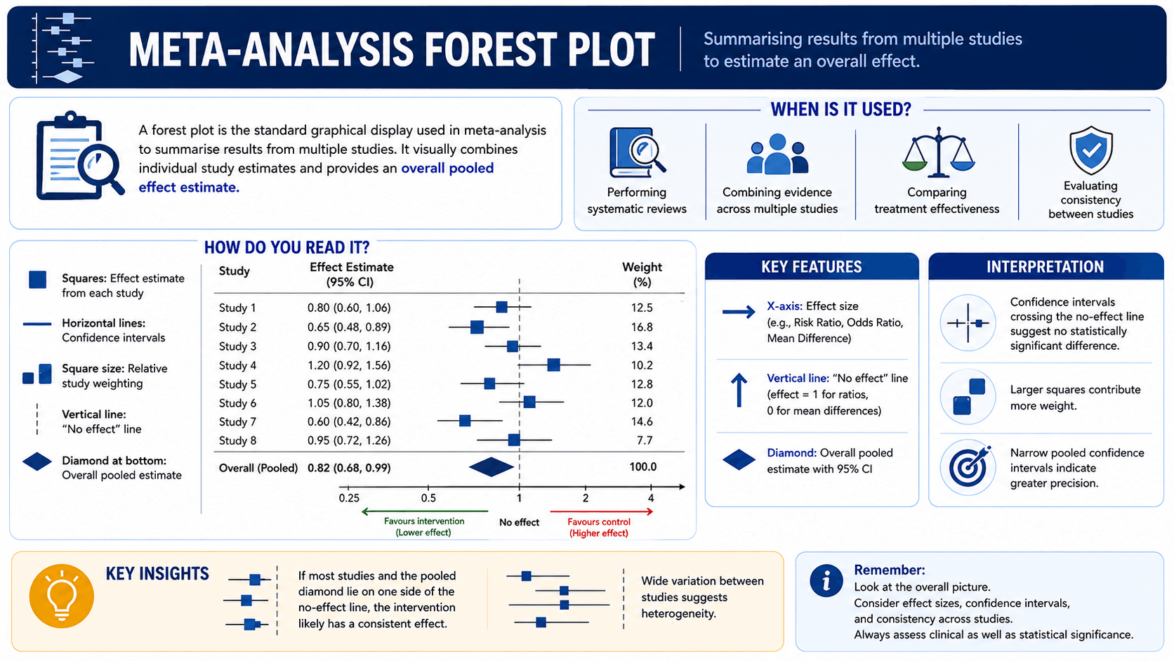
A forest plot is the standard graphical display used in meta-analysis to summarise results from multiple studies. It visually combines individual study estimates and provides an overall pooled effect estimate.
When is it used?
A forest plot is used when:
- Performing systematic reviews
- Combining evidence across multiple studies
- Comparing treatment effectiveness
- Evaluating consistency between studies
Examples:
- Does Treatment A reduce mortality more than Treatment B?
- Does a diagnostic method improve detection rates?
- Is a therapy consistently beneficial across populations?
How do you read it?
Key features:
- Squares: Effect estimate from each study
- Horizontal lines: Confidence intervals
- Square size: Relative study weighting
- Vertical line: "No effect" line
- Diamond at bottom: Overall pooled estimate
Interpretation:
- Confidence intervals crossing the no-effect line suggest no statistically significant difference
- Larger squares contribute more weight
- Narrow pooled confidence intervals indicate greater precision
Key insights:
- If most studies and the pooled diamond lie on one side of the no-effect line, the intervention likely has a consistent effect.
- Wide variation between studies suggests heterogeneity.
Final Takeaways
These four plots answer four fundamental clinical questions:
- Kaplan-Meier: time-to-event outcomes; e.g. “How long do patients survive over time?”
- ROC curve: diagnostic performance; e.g. “How good is this test at distinguishing disease?”
- Bland-Altman: measurement agreement; e.g. “Do two measurement methods agree?”
- Meta-analysis (forest plot): evidence across studies; e.g. “What does all the evidence collectively show?”
Developing confidence in reading these figures allows faster critical appraisal of clinical literature and better translation of evidence into practice.
A good rule of thumb: before interpreting study conclusions, spend time interpreting the figure first—it often tells the most important part of the story.
)